ShopDreamUp AI ArtDreamUp

Deviation Actions


Suggested Deviants


Suggested Collections


You Might Like…


Featured in Groups


Description
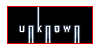
You only see the hate (the bad side)
and you don't even see all the love you got.
One person bitched at you but 5 love you and you don't even seem to notice.
It's the human nature to get all caught up in the one negative comments we recieve and forget the 5 good we got.
Haters gonna hate
Copyrighted to Bibarry Photography


and you don't even see all the love you got.
One person bitched at you but 5 love you and you don't even seem to notice.
It's the human nature to get all caught up in the one negative comments we recieve and forget the 5 good we got.
Haters gonna hate
Copyrighted to Bibarry Photography
Image size
700x526px 239.74 KB
© 2011 - 2024 bibarry
Comments29
Join the community to add your comment. Already a deviant? Log In
I love the concept behind this. Its such a strong emotional piece and that is what will capture a lot of viewers. We look at a this piece and the way that it is constructed, we do only see hate.
Like you have said in the description, there is so much love in this photograph but the person is caught up in the negativity.
The first thing you notice is the hate slip of paper, i think that hate (being such an angry word) should be written allot harsher, maybe in jagged scribbles or edgy letters to emphasise the hate.
Having said that and moving on, i like that you have put all the focus into that piece and left the others out of focus, adding to the emphasis.
As with the need for harshness in the hate paper, i like that you have added differences on the love pieces and the changes in font that are softer and more delicate, adding to the love vibe.
Something that could make this better (in my opinion) is use of minute bits of colour maybe an angry red for the word hate or some calming blues or girly pink for love which could add emotion into the photo.
Overall though, good job and good technique <img src="e.deviantart.net/emoticons/s/s…" width="15" height="15" alt="